Chart settings
You can customize how data are presented on a chart panel.
The following types of charts are available in TestArchitect’s Dashboard:
Pie charts
The pie chart is a circular chart divided into smaller sections to illustrate numerical proportions of each section in relation to the total. The arc length of each section is directly proportional to the quantity it represents. One can quickly see how various components relate to the total, and, to a lesser extent, how they relate to each other; however, you cannot easily see, from the pie chart, how much the total is (unless it is shown in a text label) or how the numbers change over time.
In the sample pie chart below, TestArchitect has executed 35 test modules, with the execution results classified as: Not tested, Passed, Passed with Warnings/Errors, and Failed. Each section in the pie chart is labeled as specified by the Data Labels check boxes on the Add New Panel dialog box. The section label information for the sample pie chart is displayed in sequential order as Series, Value, and Percentage (for example: Passed, 30, 85.71%).
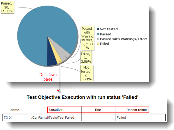
Clicking a section on the pie chart opens a drill down page showing detailed statistics for that section. The column header on the drill down report is created from the criteria defined in the data profile for that chart. The attributes as defined in the data profile for the test objective execution above are as follows:
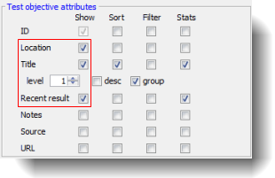
Only entries with run status of Failed are shown on the drill down report page, because that is the section of the pie chart that was clicked. Note that the check boxes Location, Title, and Recent are selected, hence they serve as column headers on the drill down report page. Note also that each item under the Name column is a hyperlink to the corresponding entity in TestArchitect.
Single bar charts
A single bar chart is a chart with rectangular bars whose lengths are proportional to the values they represent. One axis of the single bar chart displays the categories being compared and the other axis represents the actual values of the categories. You can easily compare the value of one category in relation to another category by comparing the heights of each bar. As with pie charts, a single bar chart displays the number of categories (for example, how many test modules with passing test results) having similar results. Unlike a pie chart, you cannot readily see the value of a category in relation to the total on a single bar chart, but you can easily see the magnitudes of each category and how they relate to each other.
Clicking a bar on the chart opens a drill down page showing detailed statistics for that bar’s category, similar to clicking a section on the pie chart. The column header on the drill down report is created from the criteria defined in the data profile for that chart.
Stacked bar charts
Stacked bar charts are similar to single bar charts, but they show the values in each category as built up from the values called the series. In a stacked bar chart, all of the bars in a category are stacked on top of each other. Each data item is represented as a segment in the stacked bar. The resulting stacked bar represents the sum of all of the data items in their respective categories. A stacked bar chart works well for presenting the cumulative effect of a category of data. It is excellent in showing how values in a series relate to the total value in the same category, but not how one category relates to another.
In the stack bar chart example below, two vertical stack bars represent the project’s status (New and Complete), and each status is a category. The New category has two priority segments (Medium and TO01). The top segment indicates six (or 85.71%) project implementations with Medium priority. The lower segment shows one (or 14.29%) implementation with TO01 priority.
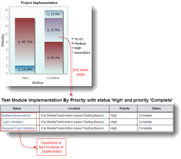
Clicking a section on the stacked bar chart opens a drill down page displaying detailed statistics for that section. The column header on the drill down report is created from the criteria defined in the data profile for that chart. The attributes as defined in the data profile for the test module implementation by priority above are as follows:
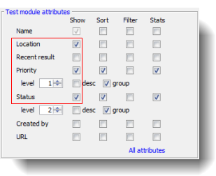
Only entries with status=High and priority=Complete (relating to the segment that was clicked) are shown in the drill down report page. Note that the check boxes Location, Priority, and Status are selected, and they serve as the column headers on the drill down report page. Note also that each item under the Name column is a hyperlink to the corresponding entity in TestArchitect. For example, if you click on the Login Validation field under the Name column on the report page, the test module Login Validation loads and appears in TestArchitect.
Grouped bar charts
Grouped bar charts are similar to stacked bar charts, but rather than stacking bars of the same category on top of one another, they are grouped together in close proximity on the graph, based on user-defined category. It is easier to compare items within the same group, but it is harder to visualize how each item relates to the group as a whole or to other groups. The sample charts below are generated from the same set of data to illustrate the differences between the stacked bar graph and the grouped bar graph. The two segments on the left-most bar on the stacked bar chart are shown as two separate bars on the grouped bar chart.
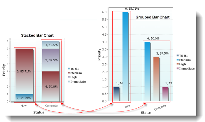
Like other bar charts on the Dashboard, clicking a section on the grouped bar chart opens a drill down page displaying detailed statistics for that section. The column header on the drill down report is created from the criteria defined in the data profile for that chart.
Line charts
A line chart is the most basic chart, being composed of one or more series of data points connected by straight lines. Line charts are used to display numeric data graphically and are useful when expressing changes in value between categories of data. Line charts are generally used to show trends and performance over a period of time. In the sample line chart below, the results of test module execution are shown for test runs over a period of two weeks. The numbers of test module executions with passing results are labeled in green, and test executions with failing results are labeled in red.
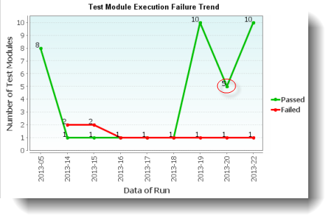
Each data point on the line chart is a hyperlink to a drill down page containing detailed statistics for that particular point. For example, clicking on the passing test module execution for the test date 2013-20 on the line chart above brings up a detailed statistics page containing a list of all test modules executed on that date with passing results.
Creating a new chart panel
You can create panels containing pie charts, bar charts, or line charts to compare and track your test results and other project-related metrics.
Editing a chart panel
A chart’s appearance, and data used to render the chart, can be modified at any time.
Related information
Category and series
Heat map settings
Report settings
Indicator settings
Chart settings