Working with TestArchitect Client
TestArchitect Client provides you with an interface to create, manage, and execute your automated tests.
The main elements of the interface are:
- A tree panel (left side of screen), containing the TestArchitect explorer tree, and displaying all open repositories, their respective projects, and all the items within each project.
- The main panel (on the right), displaying the tabs of any items you have opened, such as test modules, action definitions, reports, etc. The contents of one tab, designated as the active tab, are displayed. Depending on the type of item, multiple subtabs may appear. For example an active test module tab displays the following subtabs:
- Editor: The TestArchitect test editor displaying the action lines of the module in a worksheet format.
- Information: A number of informational fields about the module.
- Test Cases: The list of test cases in the module.
- Test Objectives: A list of the objectives for this test module and its test cases.
- Picture Checks: Baseline picture files for the check picture function.
- Results: A line-by-line summary of test results for each test run of the module. When the test module is executed, and the result stored in the repository, a line summarizing the result appears here. (Note that locally stored results do not appear in this list.) Double-clicking the line displays the complete result.
- Related bugs: A list of the marked known bugs contained in the test module (See TestArchitect bugs).
- A toolbar with buttons to perform common functions, such as running a test, debugging a test, or launching the Interface Viewer.
- The menu bar, with menus and submenus for all of the main functions in TestArchitect. Items in the menus are enabled or disabled based upon what you have selected in the tree, or what is currently displayed in the main panel.
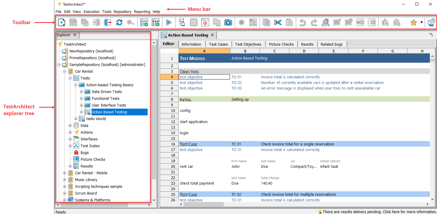
TestArchitect explorer tree
As mentioned, the left panel of the Client interface contains the TestArchitect explorer tree.
The TestArchitect explorer tree provides a hierarchical view for managing your test projects. Its nodes represent repositories, projects, folders, test modules, actions, and other items.
The top level of the tree is the TestArchitect node. It is from this node that a user can add a new repository or review the license server information.
Directly under the TestArchitect node are its child nodes, each representing a repository. Each repository holds one or more projects, and it is in each project that the essential items of the TestArchitect “toolchest” reside: the actions, test modules, interfaces, data sets, etc. These items are referred to as the TestArchitect project items.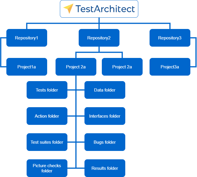
From one TestArchitect Clientsession, you can be connected to multiple TestArchitect repositories at the same time. Each connected repository is represented by a node under the TestArchitect node. If you are logged in to a repository, the node representing that repository can be further expanded to display the projects in it, plus the Built-in Actions node, which provides access to all of the built-in actions of TestArchitect, and the Systems & Platforms node, described in Variations.
Additionally, if you are logged in as an administrator, an Administration node is visible. This is used for repository-level tasks like user administration.
Folder organization
To simplify project management, TestArchitect organizes the user-defined items of each project into hierarchical structures, including:
- a Tests folder
- a Data folder
- an Actions folder
- an Interfaces folder
- a Test suites folder
- a Bugs folder
- a Picture checks folder
- a Results folder
Items within this hierarchical folder structure are added via the context menu of the parent node housing that item type. For example, to add a new test module, right-click the Tests folder node, and select New Test Module.
Fastpath: Ctrl + N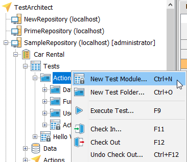
Definition tab
When you open or check out an item in the TestArchitect explorer tree, it shows up as a tab in the main panel. (Note that checking out items is part of the process of revision control, and is detailed in Projects and project items.) The item’s name appears as the tab’s title.
An icon on the tab to the left of the title indicates the type of item it is. Additionally, an icon overlay indicates item’s repository status: checked in (closed, black padlock), or checked out (open, green padlock).
Basic item icons are as follows.
| Repository | |
| Project | |
| Test module | |
| Test objective | |
| Test case | |
| Data set | |
| Action (user-defined) | |
| Interface | |
| Interface entity | |
| Interface element | |
| Test suite | |
| Bug | |
| Picture check | |
| Results report | |
| Test case result | |
| System/Platform | |
| Version | |
| Branch | |
| Action (built-in) | |
| Functional group | |
| User | |
| User-defined field |
Any tab may be closed by clicking the close icon ![]() on its right.
on its right.
Fastpath: Ctrl + W
To close all the open tabs, select File > Close All on the main menu, or right-click any tab and select Close All Tabs from the context menu. If there is any unsaved data in any of the tab pages, you are prompted to save it before it closes.
Exactly what information is displayed in the main panel depends upon the type of item selected. Most of the items have multiple subtabs, while some, such as projects, only display a single panel with descriptive fields.
There are several ways to navigate among tabs:
- Clicking on a tab is of course the most direct means of activating it.
- If there are many tabs open, a button with a down arrow appears to the right of the tabs (see picture below).
- Click the button to open a drop-down list of open tabs, then select the name of the tab that you wish to activate.
- Alternatively, the right and left arrow buttons next to the drop-down button may be used to tab through the tabs, activating each in sequence.
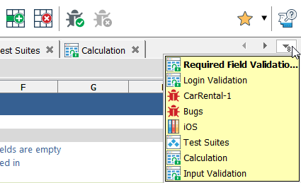
If you open an item with editable contents, such as a test module or action definition, the first subtab presents the worksheet in the editor, in which you may add, delete, or modify lines. Additional subtabs display various other types of information about the item or related to the item.
Opening a folder node, or any of the project tree nodes such as Tests, brings up a list view tab with a list of subordinate items as follows:
| Node of folder | Contents |
|---|---|
| Tests node, or a test folder | test modules |
| Actions node, or an action folder | user-defined actions |
| Data node, or a data set folder | data sets |
| Interfaces node | interfaces |
| An interface node, or an interface entity folder | interface entities |
| Results node, or a results folder | test execution results |
| Test suites node, or a test suite folder | test suites |
| Picture checks node, or a picture check folder | baseline pictures |
| Bugs node | bugs |
List view
An example of a list view of actions: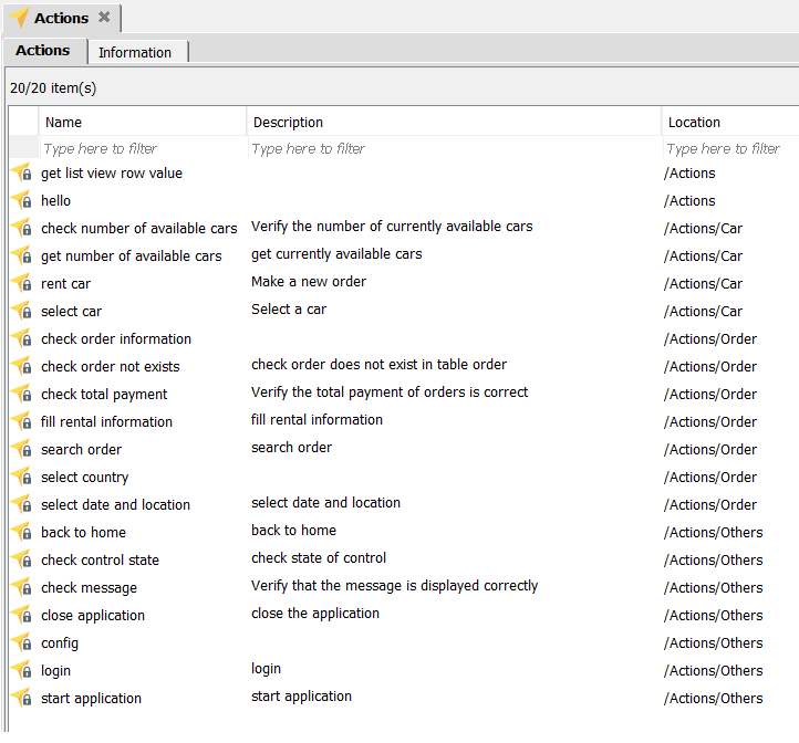
The list view can be used to efficiently perform operations like cut, copy or delete. The list may be sorted by clicking on the header of the column you wish to sort on. By selecting a row and pressing Ctrl + C to copy, the row may be pasted into another program, such as a spreadsheet, for further analysis. (Please note that, while you can also right-click an item in the list and select Copy from the context menu, this is intended for copying items within TestArchitect, and does not allow for pasting the text into external programs.)
Project item displays
Each project item – test module, action, data set, etc. – when opened in TestArchitect, has a display unique to its type. Most include subtabs for various screens, such as information fields and editors. See Project item screens in TestArchitect client for descriptions of each project item type’s display screens.
Toolbar
The TestArchitect toolbar provides easy access to the most commonly used functions of TestArchitect Client. Most of the toolbar’s buttons are context-sensitive, and hence at any given time will be enabled or disabled based on the type of item that is selected.
Project item screens in TestArchitect client
TestArchitect Client displays, by project item.
Advanced features of TestArchitect Client
This section shows several features and tools that are a bit beyond the basics.