
Creating a stacked bar chart
In this activity, you will create a stacked bar chart, which is useful for visualizing changes in relative amounts of some quantities over a given range.
Before proceeding:
- Ensure that you have a basic understanding of the TestArchitect Dashboard before creating a chart panel.
- A Dashboard portal, connected to the Sample Repository, should be open in your browser.
- Ensure that you have created a
Test Results \(unfiltered\)data profile as specified in the section Creating a data profileTutorial: Creating a data profile.
In the section Creating a chartTutorial: Creating a chart, you created a pie chart that indicated the relative numbers of Passed, Failed, and Passed with Warnings/Errors results that occurred over a period of time. But how might you observe how those proportions have changed over time? One option would be to generate multiple pie charts, using filters to specify a different time range for each. But a better solution is to create a single stacked bar chart.
The stacked bar chart consists of a sequence of bars, distributed horizontally over a given range. (In this instance, that range would be time.) Each bar is composed of two or more stacked, color-coded “sub-bars”. In our case, a given colored sub-bar represents a particular result outcome, and its size represents the number of occurrences of that outcome for that particular time period. A stacked bar chart in this case also has the advantage of indicating the total number of tests performed in each time period, relative to the other periods. That information is given by the overall height of each bar in the chart.
Once again, you can make use of the existing Test Results \(unfiltered\) data profile, which provides test results from all the historical Car Rental tests. Also note that the Category and Series values, as with your earlier line chart, are again Date of run and Result.
Create a new Dashboard panel with the following settings:
Type:
ChartData Profile:
Test Results \(unfiltered\)Display Name:
Car Rental Test Results Relative TrendsChart Type:
Stacked BarCategory:
Date of runCaption (for Category):
Date of runTime Frame:
DaySeries:
ResultCaption (for Series):
OccurrencesData Labels:
Valuea. From the Global Setting icon
 of the Dashboard’s tool bar, select Create Panel.
b. In the Add New Panel dialog, enter the values as specified above, and click OK.
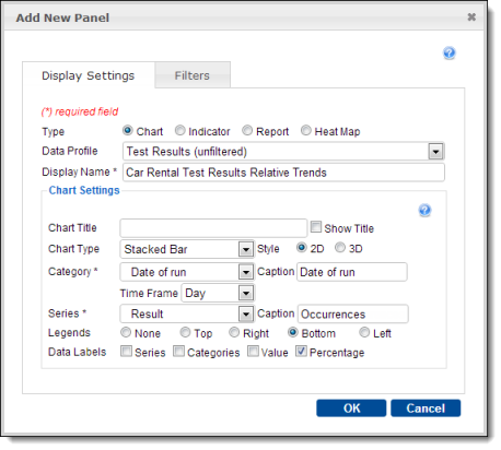
c. In the Panel Configuration dialog, select the following, then click OK:
- Select page:
Tutorial Page - Height:
400 - Folder:
Car Rental/Tests
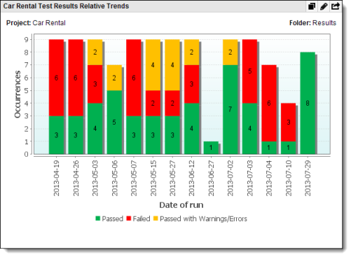
The resulting chart displays, for each date that a test took place, one to three stacked sub-bars: green forPassed results, yellow for Passed with Warnings/Errors, and red for Failed. The size of each sub-bar represents the relative number of outcomes of that result, while the size of each composite bar represents the total number of tests on that date:
- Select page:
What you have learned:
- The advantages of stacked bar charts for presenting comparative ratios of numeric data over a range, such as time.
- How to configure a Dashboard panel to present a stacked bar chart.
