
Creating a line chart
In this activity, you will create a line chart to highlight changes in test outcomes over time.
Before proceeding:
- Ensure that you have a basic understanding of the TestArchitect Dashboard before creating a chart panel.
- A Dashboard portal, connected to the Sample Repository, should be open in your browser.
- Ensure that you have created a
Test Results \(unfiltered\)data profile as specified in the section Creating a data profileTutorial: Creating a data profile.
Line charts are one of the best ways to visualize trends relating to quantitative data - that is, changes in numeric values over time. Hence, you will create a line chart that displays how the Passed, Failed, and Passed with Warnings/Errors results for the test modules of the Car Rental project have changed over time.
As before, you can work with the Test Results \(unfiltered\) data profile, which provides test results from all the historical Car Rental tests.
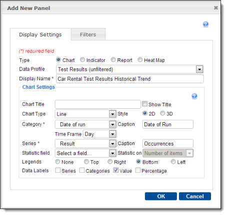
Create a new Dashboard panel with the following settings:
Type:
ChartData Profile:
Test Results \(unfiltered\)Display Name:
Car Rental Test Results TrendChart Type:
LineCategory:
Date of runCaption (for Category):
Date of runTime Frame:
DaySeries:
ResultCaption (for Series):
OccurrencesData Labels:
ValueFrom the Global Setting icon
 of the Dashboard’s tool bar, select Create Panel.
In the Add New Panel dialog, enter the values as specified above, and click OK.
The resulting chart displays distinct, color-coded lines for each member of the set defined by the Series field. (In this case, that set is
Result, which contains three members:Passed,Failed, andPassedwithWarnings/Errors. Hence, there are three colored lines in this chart.) The items of the Category field (in this case, the run dates of the tests) are displayed in left-to-right ascending order along the horizontal x-axis. The y-axis values represent counts for each possibleResult. Hence the height (y-axis value) of any given point on one of the lines represents the number of occurrences of that particular result (Passed,Failed, andPassedwithWarnings/Errors) for the run date at that particular location on the x-axis.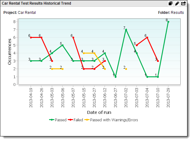
What you have learned:
- The advantages of line charts in visualizing data changes over a range, such as time.
- How to configure a data panel to present a line chart.
