
Creating a chart
In this activity, you will create a chart that displays the relative amounts of groups of data, and view drill down reports that allow you to see the detailed records underlying the chart.
Before proceeding:
- Ensure that you have a basic understanding of the TestArchitect Dashboard before creating a chart panel.
- A Dashboard portal, connected to the Sample Repository, should be open in your browser.
- Ensure that you have created a
Test Results (unfiltered)data profile as specified in the section Creating a data profileTutorial: Creating a data profile.
Dashboard offers five types of charts: pie charts, line charts, bar charts, stacked bar charts, and grouped bar charts. You are going to perform a simple comparison of the relative numbers of result outcomes (passed, failed, and passed with errors/warnings) for without any further groupings of the data. Given this requirement, the best choice of chart is a pie chart.
- Note:We’ll place all our new panels in a dedicated Dashboard page, named Tutorial Page.
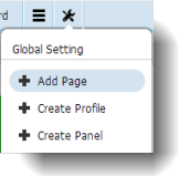
If a Tutorial Page does not yet exist on the Dashboard portal (at top left), add one:
On the Dashboard tool bar, point to Global Setting and select Add Page.
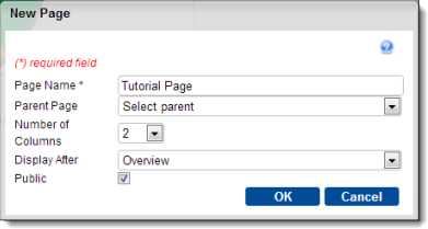
On the New Page dialog box, enter the information as requested and click OK:
- Page Name:
Tutorial Page - Parent Page:
Select parent(leave the field at this setting to allow your page to be displayed as a top level tab) - Number of Columns:
2 - Display After: (choose a page for your new page to be displayed after)
- Public: select this check box.
- Page Name:
A new Tutorial Page is added to the Dashboard’s page selection bar.
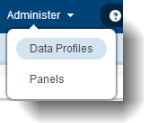
From the Global Setting icon
 of the Dashboard’s tool bar, select Create Panel:
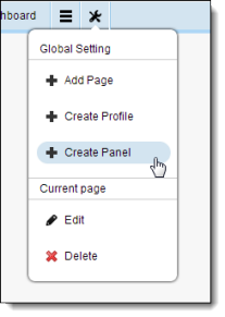
In the Add New Panel dialog, enter the information needed to define the panel, then click OK:
- Type:
Chart - Data Profile:
Test Results (unfiltered). This is the data profile you created earlier. - Display Name:
Car Rental Test Results Overview - Chart Title:
Summarized test results across test modules and dates - Show Title:
Selected - Chart Type:
Pie - Style:
2D - Series:
Result - Legends:
Bottom - Data Labels: Select both
ValueandPercentage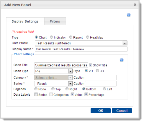
- Type:
In the Panel Configuration dialog, select the following, then click OK:
- Select page:
Tutorial Page - Height:
400 - Folder:
Car Rental/ResultsThe resulting pie chart displays, in graphical form, the relative number of Passed (green), Failed (red), and Passed with Warning/Error (yellow) results from the full range of tests specified by the associated data profile (which, in this case, is all the available test results from the Car Rental project):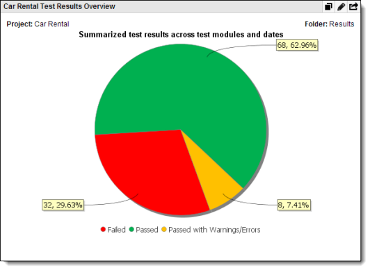
Note:Note that, when the Series value isResult, as is the case here, the Dashboard application automatically makes the color assignments shown above.Absolute numbers of respective results are provided in the yellow labels linked to each slice of the chart, followed by the respective percentages. The contents of these labels were determined by your choice of
ValueandPercentagefor the Data Labels field in the previous step.- Select page:
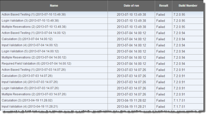
Click on the red slice of the pie chart, representing the Failed tests.
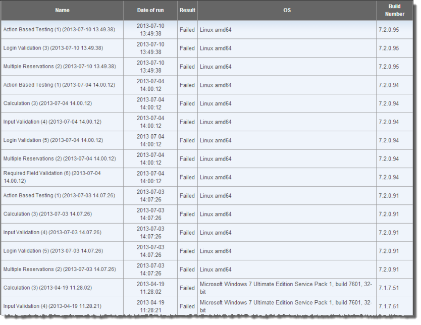
A new browser tab opens with a drill down report, displaying only the Failed result records, along with the columns you previously specified as display fields during creation of the Test Results (unfiltered) data profile.
Optional
Note:Because a Dashboard panel is dynamically linked to its data profile, modifications to the profile are reflected in a panel or drill down report as soon as they are generated or refreshed.
Let’s suppose you want to know which operating systems were hosting the AUT for each of the failed tests, and wish to see this included in the drill down report.
Modify the Test Results (unfiltered) profile and re-view the drill down report:Click on the browser tab displaying your Dashboard Tutorial Page.
Select Data Profiles from the Administer menu.
From the list of existing data profiles, click on Test Results (unfiltered).
- Note:The data profile setup facility consists of several configuation screens, displayed at left. You can go directly to any of those screens by clicking on its link.
Click on the Display Fields link on the left side of the General Settings screen.
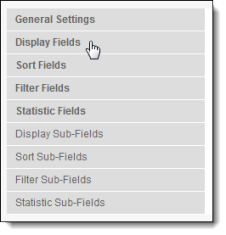
In the Display Fields screen, select the check box for OS. Leave the other check boxes as they are. Click Finish.
Return to your panel by clicking the Tutorial Page tab at the top of your display.
As before, click on the red slice of the Car Rental Test Results Overview pie chart, representing the Failed tests.
The drill down report displays the same records as it did previously, but now with the inclusion of an OS column:
What you have learned:
- How to add a page to a Dashboard window.
- Adding a new panel to a Dashboard page.
- How to configure a panel to display a pie chart.
- The value of using a pie chart to present relative quantities.
- How to edit a data profile.
- How to view drill down reports and configure them via the data profiles.
